
The Identity Workshop
Make is where hidden identity becomes digital experience.
A website decides what comes forward.
A brand decides what it is willing to be known for.
A media system decides what kind of attention it asks from an audience.
Make is where David's work in visual attention, writing, systems, sport, equipment, and public identity becomes something built.
Not agency polish.
Not a services menu.
A way of arranging attention until the work feels unmistakably itself.
Here’s what this means
Here’s what this means
Make is where hidden identity becomes digital experience.
When I build something, I am not only thinking about how it looks.
I am thinking about whether the surface is worthy of what lives underneath it.
That has become one of the most important ideas in my creative life.
A website, a brand, a media system, or a digital experience is never neutral. It teaches people where to look, what to feel, what to trust, and what to remember. It decides what gets brought forward and what stays hidden.
That matters to me because I have seen how easily something meaningful can be misunderstood when the surface does not carry the truth of it.
A person can have depth and still be perceived as confusing.
A brand can have soul and still look generic.
A product can be extraordinary and still be explained in a way that makes it feel ordinary.
A sport can be beautiful and still be seen only as scores, guns, and results.
That is why I think of this work as very similar to coaching.
In a lesson, I am trying to understand the shooter beneath the shot. In a brand or website, I am trying to understand the identity beneath the presentation.
The surface matters.
But only because it carries the deeper thing.
Good design is not decoration.
It is attention arranged with enough care that the work finally feels like itself.
02Question
What is this trying to become?
Design teaches attention.
Most projects do not fail because they need more decoration.
They fail because the deeper identity has not been made visible.
The public surface may be busy, beautiful, technically correct, or full of the right phrases, and still not feel true.
The work begins by asking what is really underneath:
Here’s what this means
Here’s what this means
What is this trying to become?
This is usually the first real question.
Most people begin with the practical problem.
We need a better website.
We need a brand.
We need a campaign.
We need content.
And those things may be true.
But if we start there too quickly, we risk decorating something before we understand it.
I know that impulse because I have felt it in my own work. When something feels unclear, the temptation is to fix the visible part first. Make it prettier. Make it more modern. Make it more polished. Add more explanation. Add more features. Add more movement.
But a more polished surface does not always solve a deeper identity problem.
Sometimes the thing does not need more.
It needs to become more true.
The better question is: what is this trying to become?
That question slows the work down in the right way.
It makes us look underneath the obvious request and ask what is actually unresolved. What is true here? What is missing? What does the audience need to feel before they can understand? What has been overexplained because it has not been properly seen?
That is the same diagnostic instinct I use in coaching.
Before correction, we need understanding.
Before design, we need identity.
- what the thing is
- what it is not
- what people should feel immediately
- what needs proof
- what should be held back
- what belongs in the center
- what has been overexplained because it has not been properly seen
03Work

Digital work with a center of gravity.
Make can hold:
Here’s what this means
Here’s what this means
Digital work with a center of gravity.
This section is meant to show that Make is not one narrow service.
It is not just websites.
It is not just branding.
It is not just marketing.
It is not just media.
It is the work of helping something find its center of gravity.
That phrase matters to me because I have felt what happens when the center is missing.
The copy tries too hard.
The design gets busier.
The audience does not know what to hold onto.
The brand keeps explaining itself because it has not yet learned how to stand in its own truth.
A brand needs posture.
A website needs rhythm.
A media system needs structure.
A digital experience needs hierarchy.
A complex idea needs a path that helps people enter it without getting lost.
To me, those are all versions of the same problem:
How do we organize attention around what matters most?
When the center is right, the work becomes easier to understand because it finally has somewhere to stand.
That is what I am usually looking for.
Not just the better visual.
The clearer center.
Brand identity
Finding the ethos, posture, language, and visual logic that make a brand feel specific.
Here’s what this means
Here’s what this means
Brand identity
Brand identity is not just a logo, a color palette, or a set of nice words.
It is the feeling of the thing.
It is the posture a brand carries before it says anything.
It is what people sense from the way it moves, speaks, presents itself, and chooses what to emphasize.
I think I am drawn to brand identity because I know what it feels like to be misunderstood.
I know what it feels like when the outside version of something does not fully explain the inside truth of it.
That is part of why I care so much about this work.
A good brand identity does not invent a fake personality.
It reveals the truest one.
It finds the part that should not be diluted. The part that deserves more dignity, clarity, or force. The part that has been there all along but has not been given the right language, shape, atmosphere, or visual system.
In coaching, I often look for the hidden pattern behind a shooter’s performance.
In brand work, I am doing something similar.
I am looking for the hidden identity beneath the appearance.
The goal is not to make something look impressive.
The goal is to make it feel specific.
The goal is for the right person to recognize it and think, “That feels true.”
Websites
Building public surfaces that carry hierarchy, rhythm, proof, story, and action without becoming generic.
Here’s what this means
Here’s what this means
Websites
A website is not just where information goes.
It is where attention gets choreographed.
Every section makes a decision. Every image, line of copy, spacing choice, button, and transition teaches the visitor how to understand the thing in front of them.
That is why I care so much about rhythm, hierarchy, story, proof, and restraint.
A good website should not feel like a pile of information arranged into a prettier shape. It should feel like the right sequence of discovery. The visitor should not have to fight to understand what matters.
They should feel led.
Not manipulated.
Led.
I think this matters to me because I do not like when meaningful things are made smaller by poor presentation.
I do not like when craft becomes a product grid.
I do not like when a person’s depth becomes a bio paragraph.
I do not like when a company with real soul looks like every other company in its category.
I do not like when a sport with pressure, intelligence, beauty, and personality gets reduced to a results page.
A strong website can protect against that.
It can give the work a proper home.
It can make someone feel the difference before they can fully explain it.
It can help the right person recognize the truth of the work and know what to do next.
Marketing systems
Creating the structure around how a thing is introduced, explained, remembered, and returned to.
Here’s what this means
Here’s what this means
Marketing systems
Marketing is not only about getting attention.
It is about earning the right kind of attention and then knowing what to do with it.
That distinction matters to me.
I do not want to build systems that simply make noise. I want to build systems that help something meaningful become easier to understand over time.
A good marketing system helps something be introduced, explained, remembered, and returned to. It gives the audience a way to build relationship with the work instead of expecting one post, one ad, one page, or one launch to carry everything.
That matters because a lot of good work gets misunderstood simply because it is presented without enough structure.
The idea may be strong.
The product may be good.
The event may matter.
The brand may have real soul.
But if the audience does not know how to enter it, the value stays hidden.
I have felt that in the shooting industry over and over again.
There are people, brands, products, events, and stories with real meaning behind them, but the meaning does not always reach the audience. Not because it is not there. Because it has not been structured, sequenced, or translated well enough.
A marketing system should make invisible value easier to see, remember, and trust.
Not by forcing people to care.
By giving them a better way in.
Media systems
Shaping podcast, broadcast, event, and content surfaces so the audience understands what matters.
Here’s what this means
Here’s what this means
Media systems
Media is not just content.
Media is how a world gets translated for an audience.
That is especially true in sport.
A broadcast, podcast, interview, recap, or event platform can either make the work feel smaller than it is, or it can help people understand what is actually happening.
The difference is attention.
What are we showing?
What are we explaining?
What are we assuming the audience already understands?
What context is missing?
What moments deserve more space?
What stories are hiding inside the event?
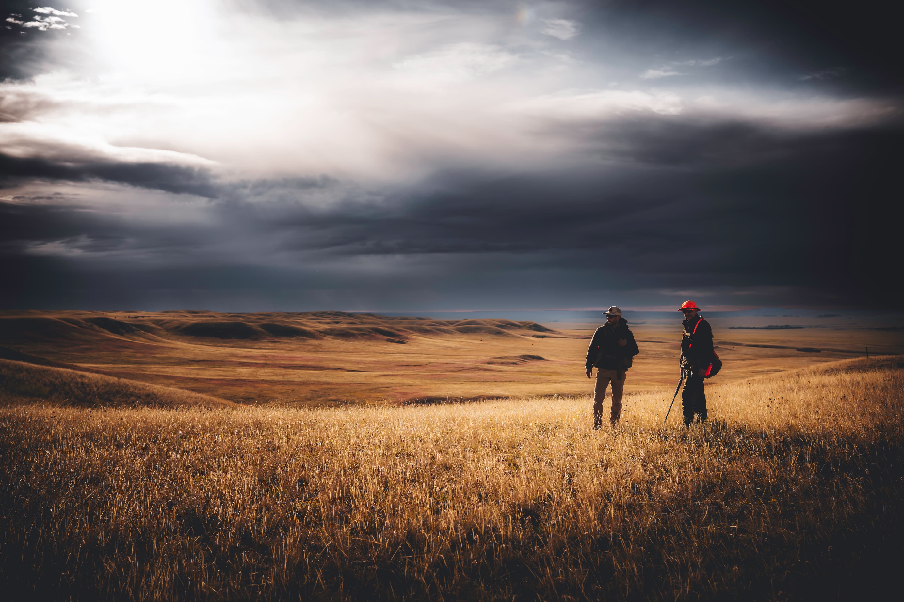
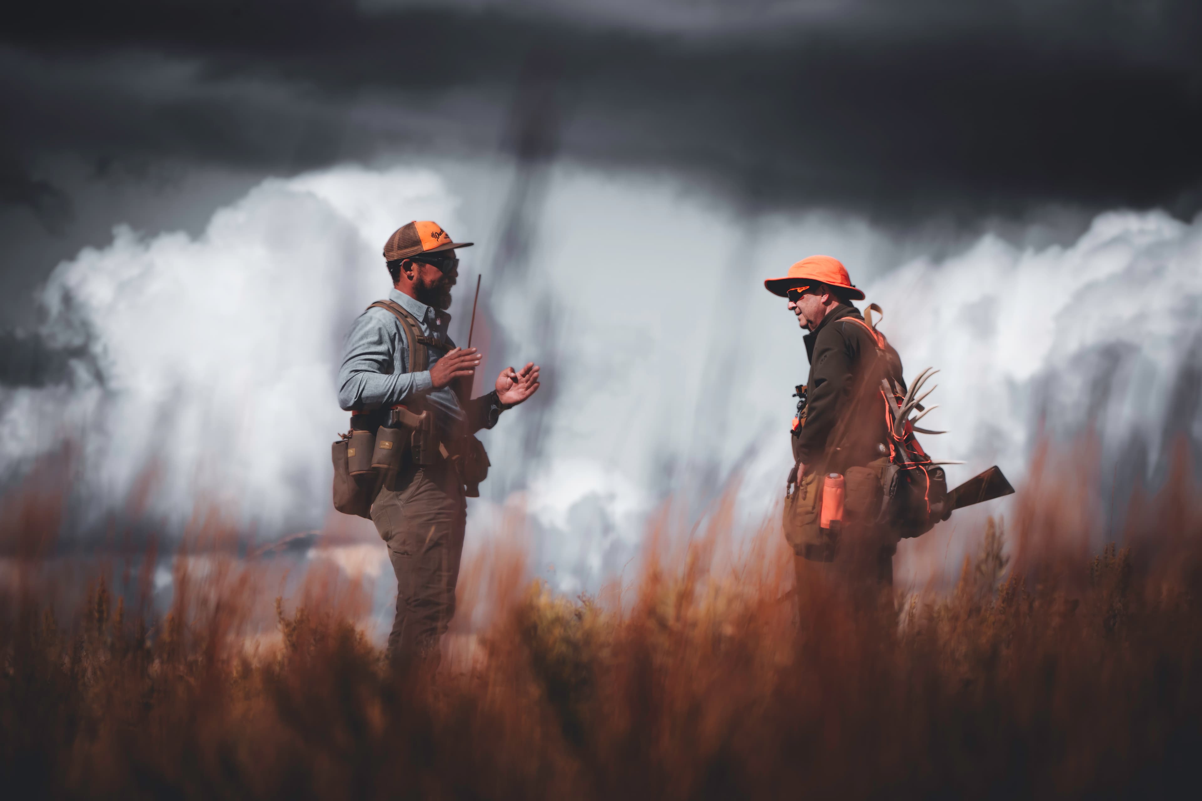
This matters to me because I know how much is happening in clay target shooting that most people never get to see.
Not just the target breaking.
The decision before the shot.
The pressure on the shooter.
The course design.
The rhythm of a final.
The personalities.
The equipment choices.
The emotional weight of a missed target at the wrong time.
The intelligence inside something that can look simple from the outside.
When I think about media systems, I am thinking about how to help the audience see the thing more completely.
Not just watch it.
Understand it.
Care about it.
Remember it.
That is why The Champions Network has never felt like “content” to me.
It has always felt like translation.
A way to let the sport become more visible to itself.
Guided digital experiences
Using modern tools and structured knowledge when they help people navigate complex material more intelligently.
Here’s what this means
Here’s what this means
Guided digital experiences
Some projects are too complex to be understood through a normal page.
There may be too much product knowledge, too much history, too many options, too many ideas, or too many different kinds of visitors arriving with different questions.
That kind of complexity does not scare me.
It actually pulls me in.
Because somewhere inside that complexity is usually a structure waiting to be found.
That is where guided digital experiences become useful.
A guided experience is not technology for the sake of technology. It is a way of helping people move through complexity with more intelligence and less friction.
That could mean structured knowledge, interactive tools, AI-assisted guidance, product education, configurators, decision paths, or immersive pages that help people feel the meaning of the work instead of only reading about it.
I think I am drawn to this because it combines so many parts of me at once: teaching, design, systems, psychology, storytelling, technical curiosity, and the desire to help someone understand something without flattening it.
The purpose is simple:
Help the visitor understand what matters, in the order they are ready to understand it.
That is what good coaching does.
That is what good design does.
That is what a good digital experience can do when it is built with care.
04Proof
Context, not case studies.
The work should show how attention becomes structure.
Several strands of work can show how attention becomes structure without turning this page into a case-study grid:
Here’s what this means
Here’s what this means
Context, not case studies.
I do not want this page to feel like a normal portfolio grid.
Not because case studies are bad.
But because the work I am trying to show is not only the finished object.
It is the way attention becomes structure.
The examples matter because they reveal different versions of the same instinct.
The Perazzi work shows how product knowledge, heritage, fit, feel, and decision-making can become a digital experience.
Archetype analysis shows how identity can be studied beneath appearance.
PerazziGPT shows how knowledge can become easier to navigate.
The Champions Network shows how media can help a sport be seen and understood in public.
These are not just examples of output.
They are examples of a way of thinking.
And maybe more honestly, they are examples of the kinds of things I cannot stop caring about.
A company whose craftsmanship deserves to be understood.
A brand whose identity is buried under generic presentation.
A body of knowledge that needs a better path.
A sport that deserves a more complete public life.
The point is not “look what I made.”
The point is “look how the hidden structure became visible.”
That is the kind of work I want to keep doing.
Perazzi USA Website
A brand and website reference tied to serious equipment identity and the way product knowledge, company posture, and shooter decision-making need to become legible.
Here’s what this means
Here’s what this means
Perazzi USA Website
The Perazzi work matters to me because it is not just a website project.
It is a stewardship problem.
That word is not dramatic to me. It is accurate.
Perazzi has shaped my life. The guns, the people, the factory, the craftsmanship, the feeling of the object, the years of competing with it, the relationships around it — all of that carries emotional weight for me.
So when I think about building a website for Perazzi, I do not think about it like a normal client project.
I think about it like trying to brush dust off a beautiful painting that has been sitting in a room most people have never fully seen.
The company has deep craft, history, and technical seriousness, but much of that value can be hard for people to understand unless it is translated properly. The gun is physical. The fitting process is personal. The product knowledge is nuanced. The decision-making is emotional, technical, and deeply tied to identity.
A normal website can flatten all of that.
That is what I do not want.
The goal is to build a digital experience that carries the weight of the thing itself: the craftsmanship, the lineage, the decisions, the feel, and the reverence people have for the object.
This is what I mean by making product knowledge legible without making it ordinary.
It is not just explanation.
It is care.
Archetype Analysis
A brand-analysis layer that studies identity beneath appearance: what kind of presence a brand carries, what it signals, and what it should stop pretending to be.
Here’s what this means
Here’s what this means
Archetype Analysis
Archetype analysis is a way of asking what kind of presence a brand actually carries.
Some brands think they need to look more premium.
Some think they need to be louder.
Some think they need to modernize.
Some think they need better language.
But often, the real problem is that they have not understood what they are.
I think this is why archetypes interest me.
Not because I want to put brands into boxes, but because I want to understand the emotional role they are already trying to play.
What does it signal?
What does it protect?
What does it invite?
What does it need to stop pretending to be?
An archetype is not a costume.
It is not a gimmick.
It is a way of clarifying the emotional gravity of a brand.
This matters because imitation is expensive.
A brand can spend a lot of energy trying to sound premium, modern, rugged, elite, approachable, disruptive, luxurious, or cool — and still feel hollow because none of it is rooted in the truth of the thing.
Identity becomes stronger when it stops imitating and starts expressing its own center of gravity.
That is what I am looking for.
The place where the brand stops performing and starts becoming unmistakably itself.
PerazziGPT
A guided knowledge reference around technical product knowledge, fit, feel, and decision-making as a more usable digital experience.
Here’s what this means
Here’s what this means
PerazziGPT
PerazziGPT is an example of making complex knowledge easier to move through.
But to me, it is also something more personal than that.
It is a way of honoring knowledge that usually lives in people.
In a world like Perazzi, there is a huge amount of information: models, platforms, disciplines, fit, feel, triggers, gauges, engraving, history, product logic, and personal preference. That knowledge matters, but it can be difficult to organize for someone who is trying to make a decision.
A lot of the most valuable understanding does not live in a simple brochure.
It lives in conversations.
In factory experience.
In fitters.
In shooters.
In years of handling the guns.
In the subtle difference between what something is on paper and what it feels like in the hands.
So the opportunity is not just to add an AI tool.
The opportunity is to create a guided reference that respects the depth of the subject.
A good tool should not make the brand feel less human. It should make the knowledge more usable, more accessible, and more connected to the real decisions people are trying to make.
Technology should not replace expertise.
It should help people find their way toward it.
That distinction matters to me because I do not want AI or digital tools to make craft feel cheaper.
I want them to help more people appreciate how much depth was already there.
The Champions Network and media systems
Sport commentary and broadcast surfaces as examples of media systems that help an audience understand what matters.
Here’s what this means
Here’s what this means
The Champions Network and media systems
The Champions Network is a media-system problem because the sport deserves to be understood more fully than it usually is.
That is the simple version.
The more personal version is that I have spent my life inside this sport, and I know how much gets missed.
Sporting clays is not easy to explain from the outside. The target presentations, the pressure, the personalities, the course design, the equipment, the decisions, the rhythm of an event — all of that can disappear if the media system does not know what to look for.
That has always bothered me.
Not because I think the sport needs to become something it is not.
Because I think it deserves to be seen more completely as what it already is.
That is why broadcasting and commentary matter.
They are not just coverage.
They are translation.
The goal is to help the audience understand what matters while it is happening: why a target is difficult, why a shooter made a decision, why a moment matters, what pressure is doing, and what story is unfolding.
A good media system helps the sport become visible to itself.
That is what I want TCN to do.
Not just make the sport look better.
Help people see more of what is actually there.
05Process
From surface question to deeper identity.
The first question may sound practical:
We need a website.
We need a better brand.
We need a way to explain the project.
We need a system for the audience.
But the better question usually sits underneath:
What is the identity trying to say before it has the right form?
What feels false?
What proof matters?
What is the audience being asked to notice?
What should the system make easier to understand?
What would make this feel human, specific, and inevitable?
Here’s what this means
Here’s what this means
From surface question to deeper identity.
Most projects begin with a surface question.
We need a website.
We need a better brand.
We need a way to explain this.
We need a system for the audience.
Those are real needs.
But they are rarely the deepest question.
The deeper question is usually about identity.
What is this trying to say before it has the right form?
What feels false?
What proof matters?
What does the audience need help noticing?
What should the system make easier to understand?
I think this matters to me because I have learned, in my own life and work, how easy it is to solve the visible problem and leave the deeper thing untouched.
You can make something cleaner and still not make it truer.
You can make something more impressive and still not make it more understood.
You can make something more polished and still not make it more alive.
That is why I want to get underneath the surface question.
Because once the deeper identity is clear, the practical decisions become better.
The copy gets sharper.
The design gets calmer.
The hierarchy becomes more obvious.
The site stops trying to do everything at once.
The surface improves because the center becomes clearer.
That is the kind of building I believe in.
06Interface
Image-making becomes interface.
Visual attention does not stop at photography.
It becomes composition, rhythm, interface, hierarchy, spacing, media sequence, caption, relationship, and the order in which a visitor learns the truth.
A frame asks the eye to stay.
A page does the same thing.
Here’s what this means
Here’s what this means
Image-making becomes interface.
Photography taught me a lot about interface.
Probably more than I realized at first.
A good frame asks the eye to stay. It decides what comes forward, what stays quiet, what creates tension, and what gives the viewer space to feel something before they fully understand it.
A page does the same thing.
Interface is not just buttons and layout.
It is composition.
Rhythm.
Sequence.
Hierarchy.
Spacing.
Media.
Caption.
Timing.
The order in which a visitor discovers the truth.
That is why visual attention matters beyond photography.
If I know how to hold attention in an image, I can use that same instinct to hold attention in a digital experience.
The question is always:
What should the viewer notice first?
What should they feel before they understand?
What should be allowed to remain quiet?
What should be discovered slowly?
What should never be flattened into a quick explanation?
This is where See and Make connect for me.
The image teaches the eye.
The interface guides the person.
Both are acts of attention.
07Begin
Build from the thing that is not yet clear.
Bring the brand, website, media system, or project that does not yet feel like itself.
Bring what is unresolved.
Bring the material that has been circling the center.
The work begins there.
Here’s what this means
Here’s what this means
Build from the thing that is not yet clear.
This is the invitation.
You do not need to arrive with everything perfectly defined.
In fact, most meaningful projects do not begin that way.
They begin with something unresolved.
A brand that does not feel like itself yet.
A website that technically exists but does not carry the right weight.
A media system that has the pieces but not the structure.
A project that keeps circling the center without fully finding it.
That uncertainty is not a problem.
It is usually the doorway.
I think I love this kind of work because I know what it feels like to circle something before it becomes clear.
I know what it feels like to have more meaning than language.
More instinct than structure.
More love for something than the current form can hold.
That is not failure.
That is material.
Bring the part that feels unclear.
Bring the material that has not settled yet.
Bring the thing you keep trying to explain but cannot quite make simple.
That is where the work begins.